Today’s work set aside to dry ….
Beginning with underpainting of Westerly Winds Victoria BC 30 x 40 inch oil on canvas

Sometimes I am asked why do I use this tool of a flowing, rather shapeless underpainting? Wouldn’t a ground colour do? Why not just begin the painting and start with a pencil or charcoal sketch to mark the forms?
The answers to these questions are interrelated and to some extent personal and subjective to my intent. So lets start with my intent with this painting – I want my viewer to be standing along this specific shore on this specific day and be able to feel their presence within the landscape. Admittedly not a small task considering that 80% of the North American population lives in urban centres and has limited ability and time to spend watching how a specific landscape looks at different times of day and at different times in the year. Still, I believe part of my job is to provide this experience which then becomes more familiar to the viewer in the face of the actual physical environment. I make no assumption at all that the viewer is familiar with what it is I am about to paint. If we keep this in mind, it helps to understand the task I must complete with a rather simplistic landscape in order to convey the power of the universe through the sun, sea, and land.
First, in this case I began with a quick 20 minute plein air sketch yesterday.
I wanted and needed that time on the shore to gather as many sensory notes as possible so that I can retrieve them for this work. So let’s unpack this underpainting process.
To proceed with a loose flowing “sketch” if you will for the underpainting is preferred in this case because the simplicity of the landscape makes it all the more difficult to render the movement and tension between the elements in the scene. This style of underpainting is preferred to a ground in this situation because the process provides a first check on the “rightness” of the composition for the intended purpose. The reds, yellows and oranges are simply a tool to bring the most movement and brilliance to the greys, blues, browns, yellows and whites of the finished landscape. Through trial and error I have found these pigments for underpaintings the most effective for capturing the significant range of lively blues in our west coast landscape. Therefore, the underpainting adds a strength to the end result that is near to impossible to replicate by beginning with the specific colours of the finished painting.
Do I always do an underpainting? No. Its use depends on my subject and my intention for the finished work. I sometimes do a quick painting sketch and work with the white canvas. I sometimes use a ground colour only. I sometimes work with wet grounds too. But this kind of underpainting, used for this work, is a favourite and there are reasons for this that go beyond any visual result and more to an intuitive remembering.
When I work a canvas up with this kind of underpainting, I begin to physically learn the window of space and the painting language that will be translated onto the canvas from my sensory information which I have gathered up to this point. My physical reference material will often include both photography and painting sketches.The sensory information is much more than what I see. It includes what I heard, smelled, tasted, and felt. There was the rolling of the stones on the shore beside me and the steps of people walking past. I could feel wind pushing cold air into my back and brushing my hair across my face. I could smell the cold dampness of snow, rain and salt. My eyelashes were cool. My hands were stiff with cold. But there was a warmth in the gray, the blue-green and the a brightness in the sky that was punctuated by the sturdy cliffs and the jut of land. It is all of this that I must translate into brushstrokes. The movement of the brushstrokes for the underpainting are like rough notes for the beginning of this painting conversation. I am intimately aware of the forcefulness between the elements of this seascape. I want this on the canvas from the very beginning.

I hope this helps to explain why I sometimes find this particular process of underpainting necessary to the rendering of my final work. Thanks for joining me and all the best of today.
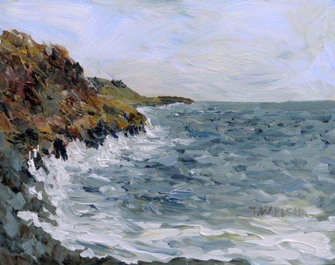
Here is the finished painting:
Westerly Winter Winds Victoria BC – 30 x 40 inch oil on canvas

Details and purchase information are available HERE.
© 2016 Terrill Welch, All rights reserved.
Liberal usage granted with written permission. See “About” for details.
Creative Potager – Visit with painter and photographer Terrill Welch
From Mayne Island, British Columbia, Canada
For gallery and purchase information about Terrill’s photographs and paintings go to http://terrillwelchartist.com